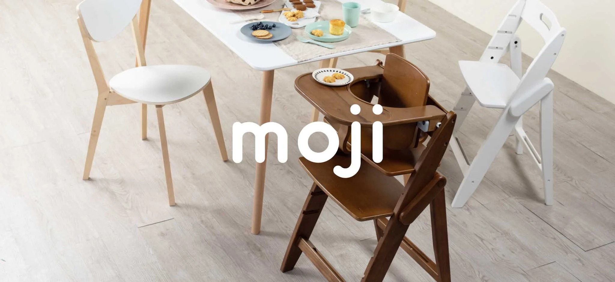
moji
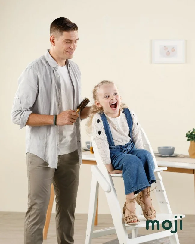
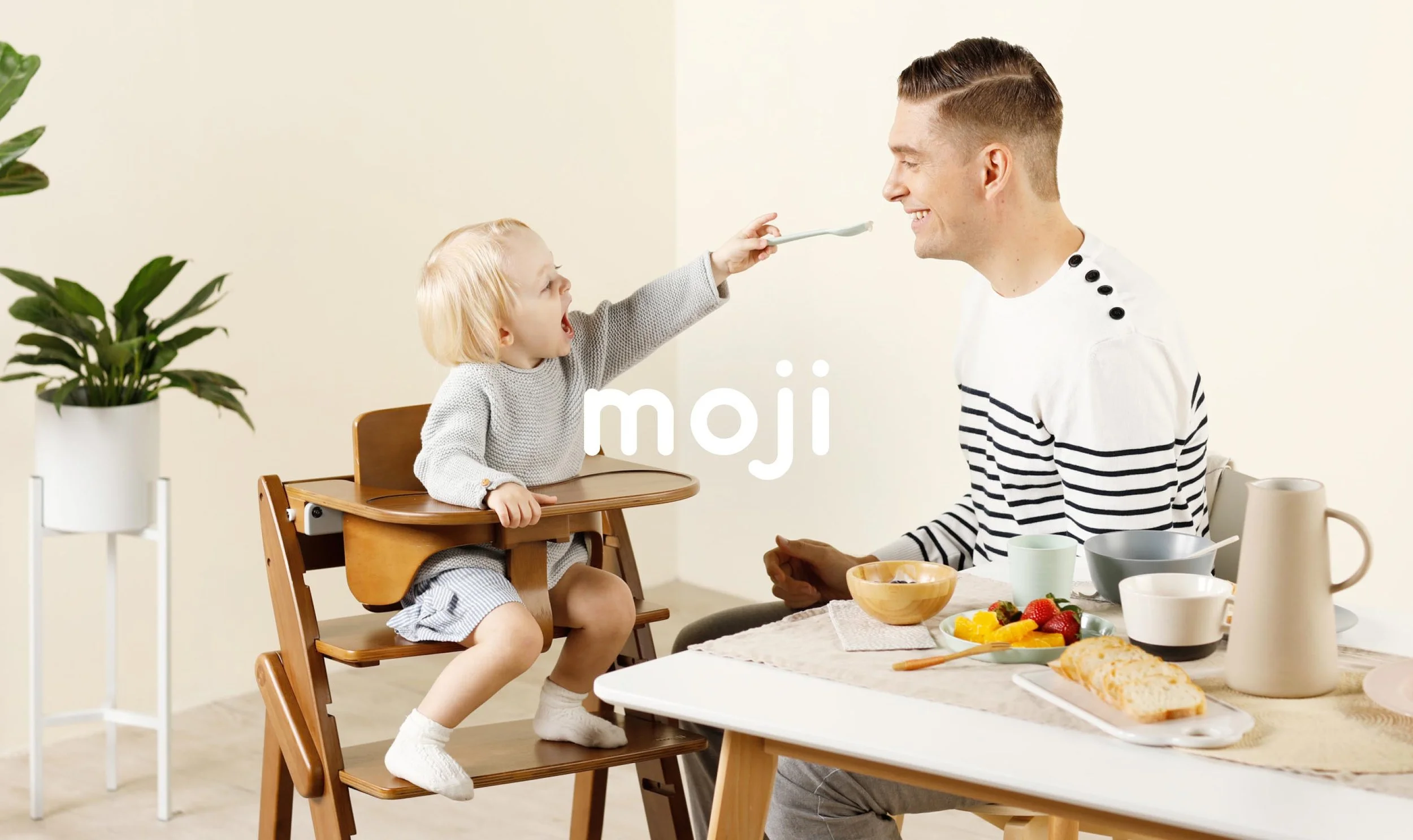
Moji is a smart German-designed brand, their focus is on enhancing modern parents' lives while ensuring babies' comfort and the essence of quality parenting products. They aimed to create a new identity that showcased their high-quality, sustainable products and set them apart in the baby product industry.
Role
Creative Director
Project Scope
Logo Design
Brand Guideline
Imagery Guideline
Creative Direction
TVC Production
Year
2018
Location
Hong Kong, Germany
Partners
Grand Manner
Strategy
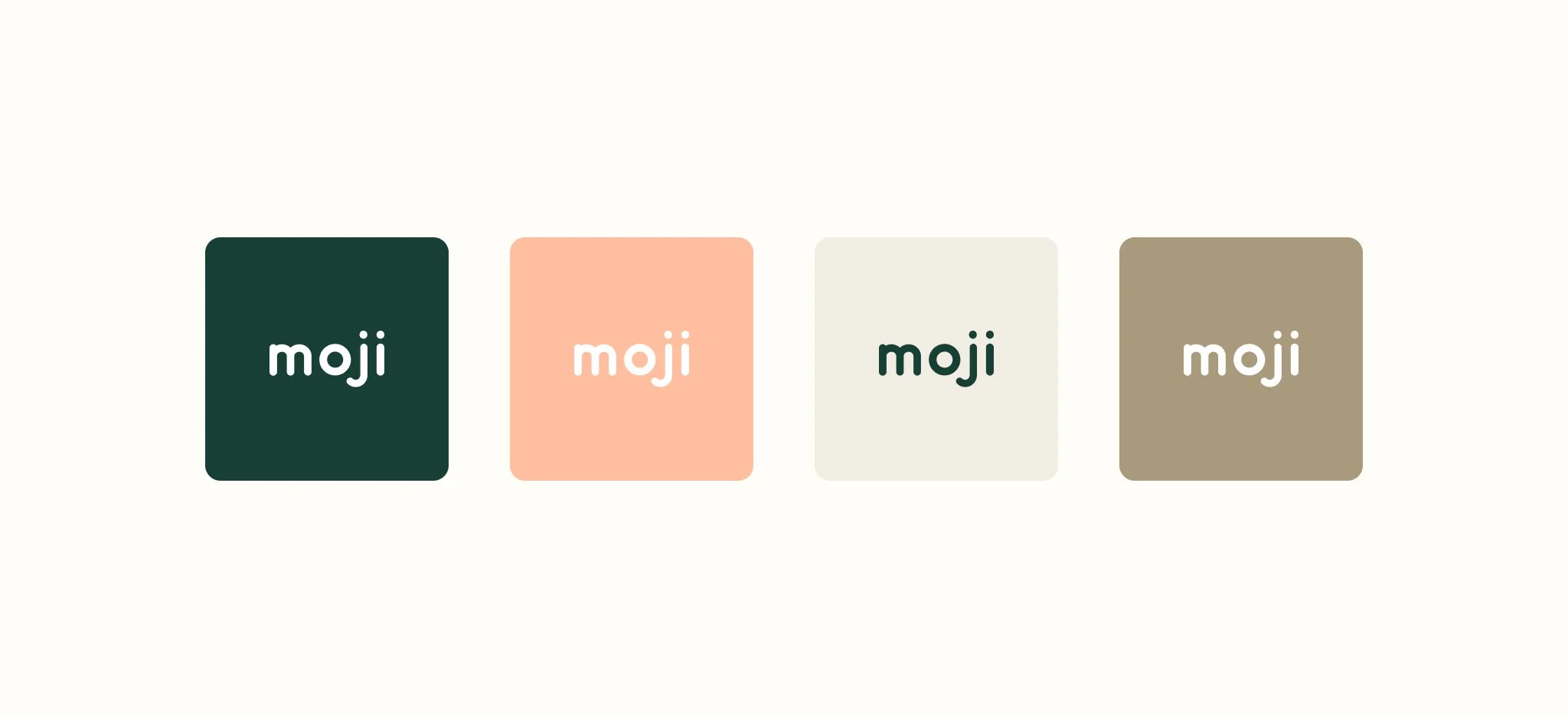
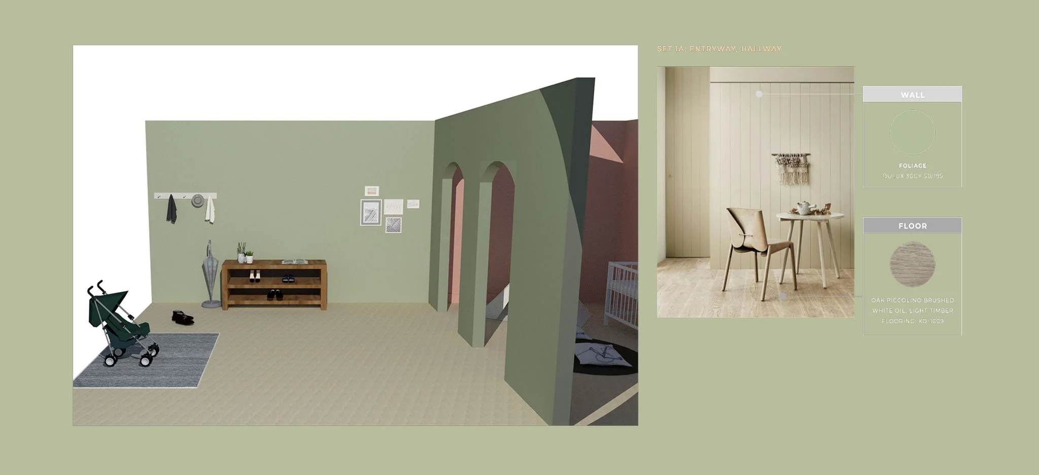
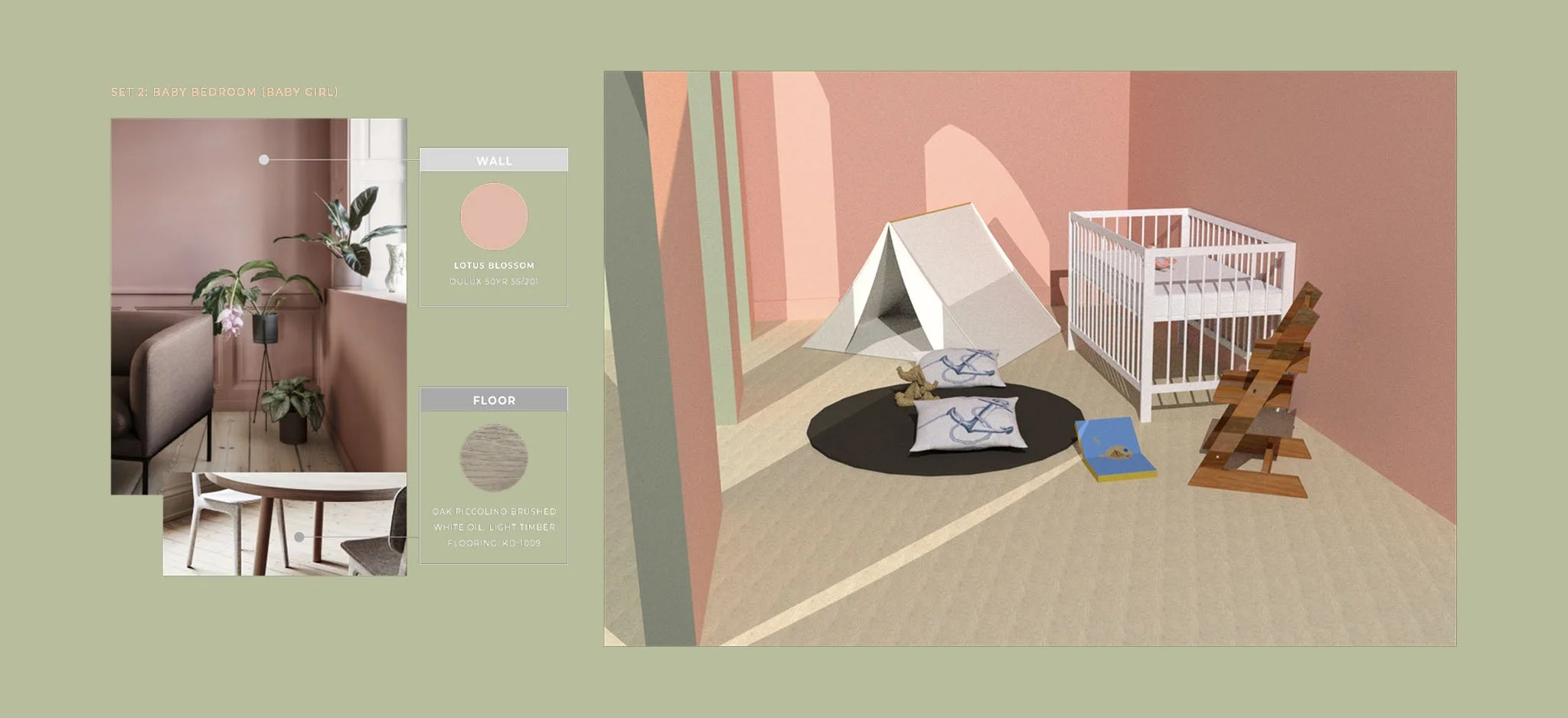
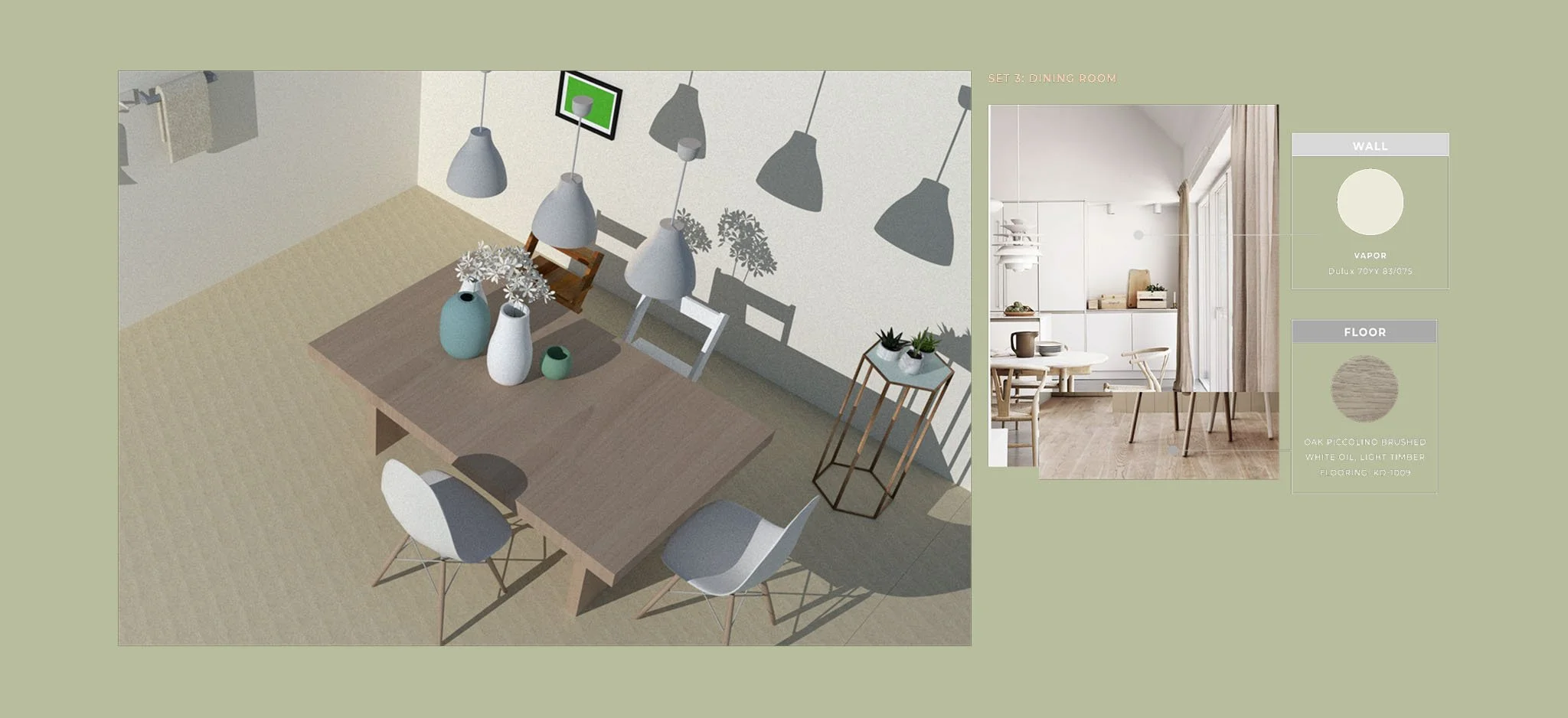
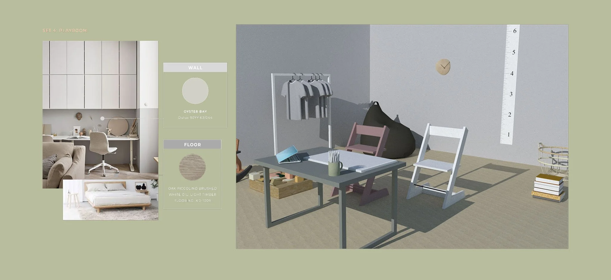
The brand voice is decent, smart, and passionate, focusing on sharing blissful moments and educating modern parents. Moji presents a calm and timeless essence with minimal and harmonious design elements inspired by tree rings. Grounded in Scandinavian design principles, Moji emphasizes an organic feel, fostering meaningful connections with families and enhancing joyful experiences.
Design
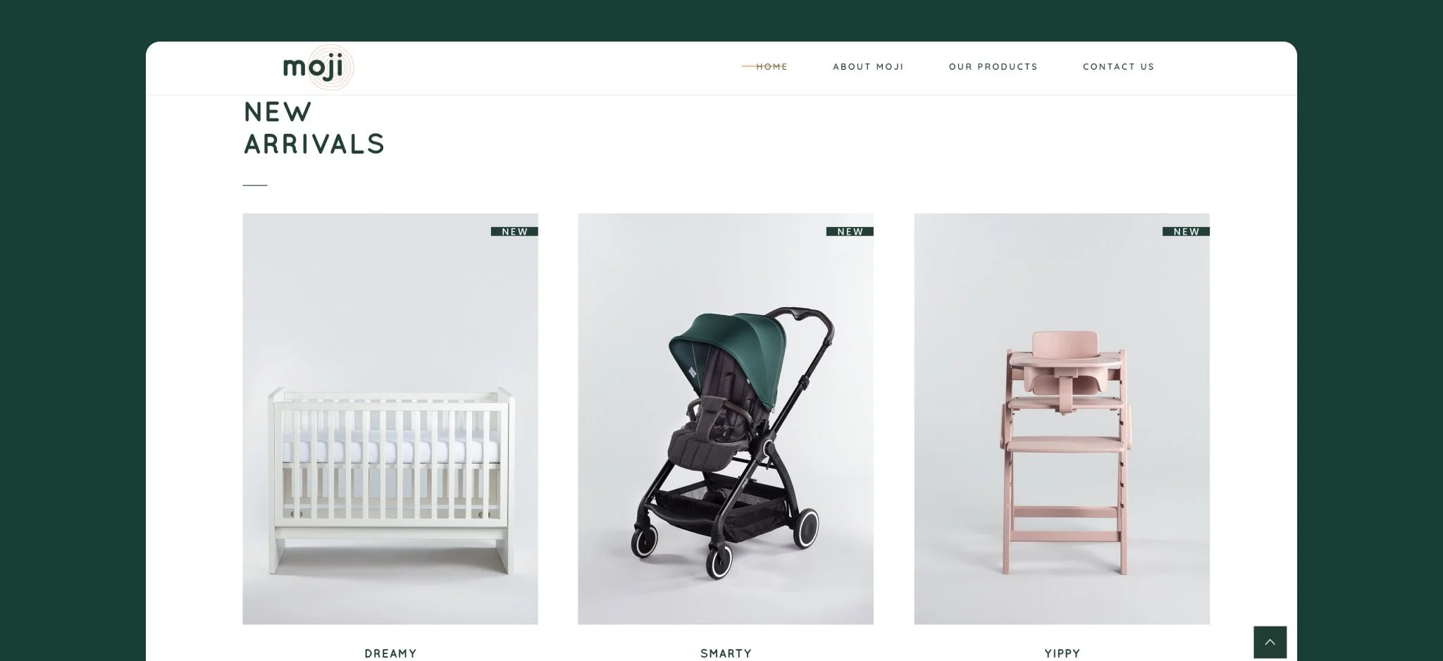
The design elements are inspired by tree rings and the brand's logotype, symbolizing the essence of the brand and representing a lifelong journey. The primary color palette features forest green and peach nectar, reflecting its connection to nature. Drawing inspiration from Scandinavian design, this aesthetic imparts an organic and natural feel to the brand.
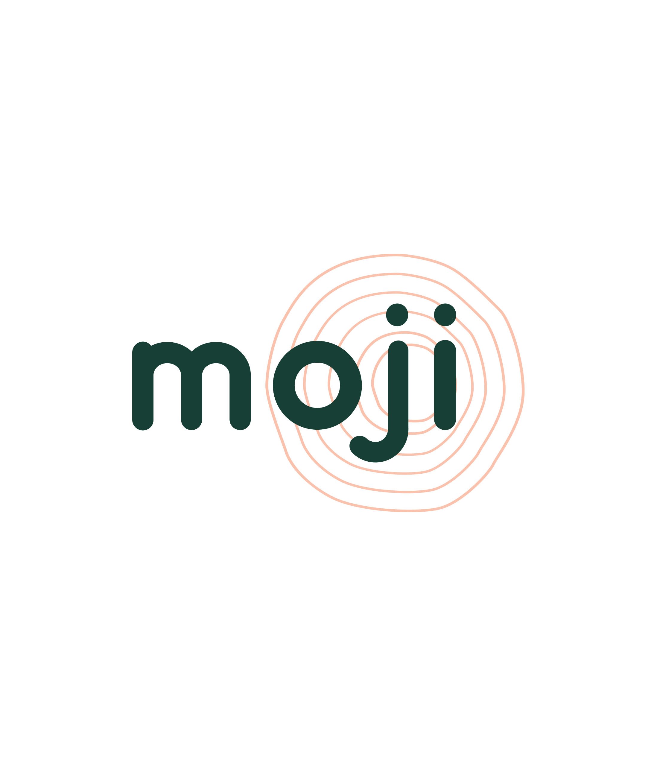

Logo icon communicates the timelessness of minimal and harmonious design through a tree rings element.